Friday, April 27, 2012

Alphabet stone

The last three days have been the most challenging so far; the amount I've learned about the classical Roman alphabet is directly proportionate to the number of mistakes I've made trying to design one. I was brought back to the early days of my carving self-education: I knew I wasn't doing it correctly, but I didn't know how to make the tools do what I wanted, and the stone certainly wasn't divulging any secrets. Fortunately Nick was there to help me push through the blockage of confidence and limitations of skill. It took three trial layouts, but this morning I put the finishing touches on the alphabet that will get me to the stone.


It's difficult to make out pencil on tracing paper, I grant. You'll just have to trust me that it's the best I could do. It's an interesting document because some letters are partially obscured by generations of erasings and redrawings, particularly the N, O, Q, S and W, all problem letters. It is a portrait of effort, of a subject refusing to sit still and behave. Some minor spacing issues will have to be resolved at the tracing stage, but I was only too glad to begin transferring, anything to get back to carving. Before I could pick up a chisel, though, a good amount of fabrication needed to be done. First I had to cut the stone to size. The width was already established at 10.625". Nick and I agreed that a height of 18.5" would make for a comfortable dimension. On went the wet gear and out came the saw.


Nick's tiny wet-work skull cap fits me only if I wear it at a jaunty tilt. The lobstering get-up brought me back to my first morning at the JSS, a fond and distant memory as my six weeks begin to wind down. For stock I'm using the other half of the Italian slate panel I cut that day. When I went to measure out my 18.5" I realized the stone was very far from square, necessitating two cuts. I've cut plenty of two-by-fours in my day, and but for the sweet smell of sawed pine you can hardly be sure the blade is making contact, so effortless is the glide. Stone does not want to be cut. The saw labors, the water-cooling obscures your drawn measurement with slurry and you're pretty sure you're going to lose your hand somehow. Disaster averted, I managed two clean cuts, with two pieces of slate for later projects to spare. Next comes the angle grinder, which Nick capably demonstrates here.


This surfaces each edge of the stone to flatten any grooves or bulges left by the saw. It only takes a light touch of the grinder to take off the necessary material. We also put a protective chamfer on the carving side to keep the grinder from ripping off a corner. This process leaves fairly rough blade marks along the edges, which need to be gritted down by hand with a sanding stone. Tiring and tedious work, but the smooth surface is worth the effort. Makes it nice.


Once that dries, the stone is ready for the transfer. Passing the scribe over my penciled outlines was like walking through an alphabetic fun house, each letter a mirror image of the classical form distorted by odd weight distributions and other optical hijinks. Flawed and weird for sure, but there is a redeeming honesty in the fact that they are my letters. At some point you just have to own the best you can do, even if it's not actually very good.


Tuesday, April 24, 2012

Carver's lament

I've taken a break from carving to begin designing an alphabet stone. Progress, meet wall. Trial brush-lettered layouts were beyond miserable, I just could not get the letters to flow. I took a walk to clear my head, read an inspiring essay by Robert Bringhurst and returned to the shop, only to struggle anew. But I kept at it and eventually finished the day with a skeletal alphabet on scraps of paper torn off of layouts I used in sudden games of trashketball. It wasn't much, but it would carry me into the overlay stage, tracing the skeletals, adding serifs and adjusting the letterspacing. Altogether a humbling business, especially within a hundred mile radius of a Benson. But I should mention here that Nick's deft touch as a teacher has made an enormous difference. What could have been a day lost to despair was salvaged with a reminder that lettering is a lifelong process of failing to achieve perfection. Get used to it. The work is hard. Do the work.

Since I'm a far better balancer of stone than I am a calligrapher, I've decided to play to my strengths here. Pictures from last weekend of a happier place in a fine storm, where an anonymous visitor has contributed a new slant to the conversation. 


Monday, April 23, 2012

Reddy, deah

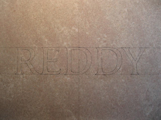
A dog may well be man's best friend, but sometimes a dog's best friend is another dog. My reward for doing a good job on Peter's stone, besides the feeling of having done a good job, was to carve a stone for Peter's pal Reddy.


Having grown accustomed to the unique characteristics of Buckingham slate, I turned to the fresh challenge of pink Tennessee marble. It's actually a kind of limestone, but it performs and polishes like marble and so has been popular among architects and builders, especially in Washington, DC. Reddy, as his name indicates, was of a reddish hue, and since a brick gravestone would be awfully small and perhaps a bit unsporting not to mention dreadful to carve, he gets the Tennessee.

I finished transferring the layout and was about to set chisel to stone when John Benson passed by looking for Nick. He usually does a few laps around the shop over the course of a day "looking for Nick", but if I were to hand out badges to the crew of the USS JSS John would be the Morale Inspector. He checks in on everybody, offers a verbal backslap of support and leaves you with the feeling that you're the right man for the job. But sometimes his pep talk sounds all too familiar. On this occasion he looked at Reddy's stone and then at me and said "Don't (screw) it up!"

But then I very nearly did. The marble crystals tend to pop unpredictably, often taking a lot of material with them. After the first few passes it isn't much of an issue, but when the final depth of the v is being established, a badly dislodged crystal can completely alter the shape of the line. And because the stone is so much harder than Buckingham or Italian slate (Nick: "It'll make you cry." Sweet!), chisels can lose their edges fairly easily. As in they snap off, which means a frustrating while spent at the diamond sharpening stone removing enough precious tungsten to restore a straight edge. Another difficulty is the lack of contrast between surface and carved letter, requiring a deeper cut to enhance the interplay between light and shadow. I figured all of this out in time to avoid any major catastrophes and while it didn't exactly make me cry, I wasn't smiling, either. Until the end, that is.


Sunday, April 22, 2012

Peter II


No sense in procrastinating: it was time to do right by Peter. I took a deep breath, picked up my tools and looked to Nick for the go-ahead. "Don't (screw) it up and don't stress about it." Roger that.

Buckingham slate is quite a bit harder than the Italian slate that I had gotten used to, and the cleft surface an added challenge I had not yet encountered. As a flake is approached with the chasing edge of the chisel, the carver steepens his angle and makes a few light chops so as to avoid blowing out the stone. In other instances, the stroke travels down a step from a bulge in the surface, which will require adjustments later as the cut deepens. But after negotiating the differences for a few hours I began to enjoy some of them. Like the fact that the line at the bottom of the v is easier to keep straight. Also Buckingham is less prone to undercutting, when the sunken edge of the chisel chews into the opposite plane of the cut, necessitating a corrective pass of the chisel occasionally when there isn't much material to spare. The carved stone reveals a clean, bright field of gray for a beautiful contrast and less conspicuous chisel marks, which if the stone is to be painted or gilded should be kept to a minimum. Especially if it is to be gilded as the gold shines like a flashlight on every wobble, chip and pluck.

Minding Nick's contradictory but effective advice, I proceeded with enough caution that I did not in fact (screw) it up and rather welcomed the opportunity to do real work for a real client. It took me two days to complete, a snail's pace even for a stone carver, but Nick's evident approval at the sight of the finished work ("What's wrong with that?") had the ring of a teacher gladly handing out a passing grade.


Friday, April 20, 2012

Third & Elm

Wednesday night was the Society of Printers' 39th Annual Dwiggins Lecture at the Boston Public Library, the first one I've missed since I began attending six years ago. It features a printer, type or otherwise graphic designer at the vanguard of their discipline holding court on their body of work and its engagement with the art of visual communication. Beyond one's level of interest in the evening's subject and speaker, in this instance David Lemon on Adobe's pioneering work in digital type design, there is invariably the social aspect to these occasions, when it seems like everyone in Boston is a printer of some description, at least for one night. I missed seeing friends and taking it all in, but my evening was not misspent. I did the next best thing by paying a visit to a printer and fellow SP member here in Newport, Ilse Buchert Nesbitt of Third & Elm Press.


With her late husband Alexander Nesbitt, Ilse founded Third & Elm in 1965, printing and publishing all manner of books and ephemera supplemented by Alexander's calligraphy and Ilse's lovely woodcuts. Her shop is an incredibly charming live/work space in the historic Point district, as John's wife Karen has it, an unpedaled bike ride down the street from the John Stevens Shop. Ilse now devotes most of her time to making rice paper, printing elaborate note cards directly from the blocks and depicting town and garden life in beautiful, large multi-colored woodcuts. The spirit of vivid whimsy unifying her work reminds me of Elisabeth Hyder, whose Brookfield Paperworks and collaborations with her husband Darrell's Sun Hill Press produce an amazing variety of paste papered boxes, journals, note cards, you name it. But while Elisabeth's sensibility leans toward colorful pattern making, Ilse's work evinces a childhood spent in Japan mixed with a linear vitality as distinctive as her German accent.


We arranged to meet at the end of the day, and by way of introduction I brought over some examples of recent work. She immediately seized on a decision I had made to justify text in a broadside that might have been happier flush left, saying philosophically that "Life isn't justified." I took her point, noticing the compromises in letterspacing I had allowed to get my desired shape. An important reminder that sometimes life just wants to be set loose rag.


It was fine English weather all day, not great for pictures so I didn't take very many on this first visit. But after a good conversation and a dime tour of the shop, Ilse encouraged me to stop by again before I leave Newport. Now that Paul Russo has given me a small block of endgrain maple and the engraving tools are at hand, perhaps I'll have something to print with when I do.


One of four make-readies for this particular print:


Taken on a brighter day.

Thursday, April 19, 2012

Peter I


A stat: In eighteen days at the Shop I have carved 33 stems and two complete alphabets, plus a handful of beach stones. Closing in on a hundred characters, perhaps about as many as I carved in the first two years of independent study. No lower case or italic yet, so you might say my repertoire is comparable to that of a Roman stone carver of two thousand years ago. I would not have fooled the anonymous master responsible for Trajan's Column, but perhaps on the frontier of the Empire I might have passed for a dab hand. Or as I liked to say before I got to Newport, I'm about as good as any Colonial farmer, many of whom counted the carving of gravestones as one of their ten thousand tasks.

It is gratifying, at any rate, to have progressed enough over the last two weeks to take on a time-honored Jedi test of skill for the apprentice carver: the pet stone.


Peter, it must be assumed, was a good boy. So good that his name has been commissioned to appear on a slab of shaped and chamfered Buckingham slate somewhere in his owner's yard. For the layout Nick called up a shop Roman on his Mac, fiddled with the letterspacing and pressed Print. To prepare the stone for transfer I scribed a center line down the middle and two horizontal lines indicating position and letter height. Paul kindly gave me a hand.


Before the layout can be positioned properly the center of the line of text must be determined. This is done by folding the sheet of paper so that the outer characters overlap, optical adjustments having to be made in cases where stems meet up with diagonals or bowls, as in the case of P and R.


Once that's decided the layout can be transferred with a steel scribe and a sheet of carbon paper. The Buckingham slate has a cleft surface and trying to draw a straight line on a rough natural surface can be a challenge. Slow and steady finishes the race.


The transfer rendered a bit weakly, so Nick had me go over the lines with a watercolor pencil to brighten them up. Normally one would carve from rebrushed letters, but there wasn't the time.


Now it's all over but the carving. . .

Wednesday, April 18, 2012

Hugh Grace, Hugh Grace!

The atmosphere at the John Stevens Shop is a notch more jubilant with the arrival of English lettercarver Hugh Grace, who is in Newport for two weeks to carve a rampant lion on a massive marble ledger. Hugh lived and worked here at the Shop for two years from '02 to '04 and meanwhile has freelanced for Richard Kindersley at his Studio in London. An incredibly fast and dynamic carver, he is a gentleman and a gentle man, slightly embarrassed by the all the fuss kicked up with his return. But he's taking it all in stride and getting into a good rhythm, and the marble is flying.


As for me I'm still having a blast.

Monday, April 16, 2012

Addendum


Looks like the wind got to my sculpture park before the teenagers did. Meg and I went back on Saturday afternoon to see what became of the obelisks in the brief interim. There's just enough chance in the fallen stone as bridge to indicate nature at play, though it would appear that the site was not without visitors in the last two days. Someone built a small cairn on a slab near the foot path, perhaps as a gesture of fellowship from a delighted explorer.


I was impressed by the fact that the cross bar of the big T was still serenely balanced on its stem. Clearly there was more left to do. I set up a line of stones marching over a beautiful grooved slab, wedged a propeller-shaped stone into a crevice to support a column, and hauled a four-foot needle onto a perch for 30 satisfying seconds of poise.


Meg got in on the fun, too.